
It is hard to believe that another project pack is behind us. Every project pack is exciting, but the project pack that coincides with the 12 Days of Zentangle is always extra special. Zentangle Project Pack No. 22 was no exception, a true labor of love, this series gave us the chance to share with you 12 days of tangling and shading that pushed limits and encouraged us all to step out of our comfort zone.
Our Project Pack Series truly plays with the Zentangle philosophy of the “Elegance of limits”. We set parameters around a collection of supplies, an intention of techniques, and many times a specific style or approach. This challenges us, as artists and tanglers, to use our Zentangle skills to dig deeper and stretch ourselves beyond our comfort zones. It entices us to explore and play in ways we may never have thought of.
After each series is completed, we love to take a moment to reflect on our own journey through the project pack and through the feedback and artwork shared by all of you. It is always a joy for us to see all the interpretations of the lessons. Each one is as special as the next, watching a tangler spread their wings and fly off in a direction we had never thought of. It is all so beautiful to see.
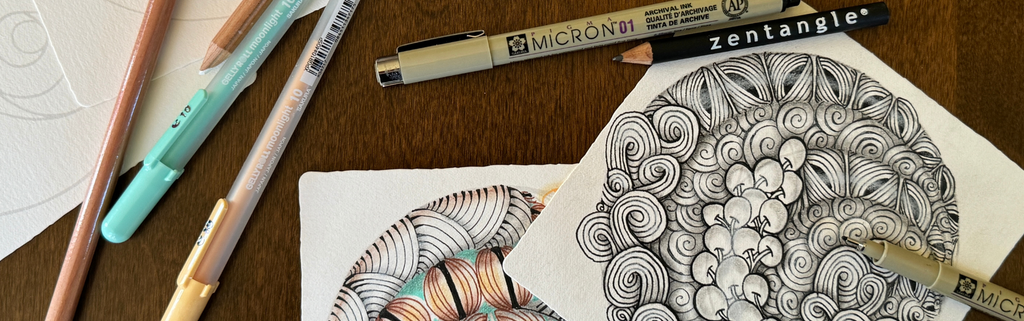
One aspect of this Project Pack that was a topic of discussion in online forums and in customer emails was about the role of color and the departure from the basic black and white. That is a good question and discussion to have. We believe there is room for all of it. With the Zentangle Method, you get to choose. You are the artist! If you like working within the elegance of limits of basic black and white, and shades of gray, that’s awesome. But if you get excited to add a little Gelly Roll here and there, that is great too. Perhaps you enjoy learning about a new tool, if only just to try it. We set out the guidelines of the 8-steps, to do just that, guide you, but you are the artist, and you are a beautiful creative being, and you get to choose the next stroke and you get to choose what pen and you get to choose what lessons to do or not do.
Personally, I would say I am a traditionalist, so it is no surprise that this is often reflected in my Zentangle art. I tend to stick with black, white, and brown. There are times though that I am inspired to explore and embrace color and Project Pack No. 22 was one of those times. I enjoyed adding layers of warmth and pops of color with these tools. Working with color is an entirely different facet to the Zentangle Method for me, but it is one I find worth exploring, even if I know I will go back to my comforting black and brown. There was a time when using a white charcoal pencil was new to me. It was awkward and felt foreign. Now, I think I use one on every tile I do. Our practices evolve, we as tanglers evolve, art forms evolve. It is how we grow. It is how we grow together.
Working in color is fun, exciting, and challenging but do you have to work with color in your practice? Absolutely not. That is up to you.
There are times that color can feel overwhelming, and that extra layer can feel daunting. Those are times when I will choose not to embrace color and stick to what brings me comfort and joy – black and white. Whenever there is something that is not benefiting your Zentangle practice, then choose something that does. The choice is yours!
The wonderful thing about the Zentangle Method and our Zentangle Project Packs is that there are no rules. We offer you structure, ideas and inspiration and we trust that you will take what you need for your own Zentangle practice.
So, what happened to just black and white, you ask? Nothing at all. Black and white is always here – our firm and flourishing foundation for creativity and inspiration.

If you are in the mood for a Zentangle Project Pack of a more traditional approach – may I suggest to you Zentangle Project Pack No. 4 or No. 10, or any of them and just omit the color.
If you would like to explore the 12 Days of Zentangle before they were project packs, check out this blog post.
Jeanine on
Roz Stendig on
I recently received PP#22 and loved looking through it. I decided though to go back and finish a few others that I hadn’’t started before taking on #22 I too have struggled with using color but very much appreciate that Zentangle gives us the freedom to make art our way and we’ve always been encouraged by ZHQ to make it our own. I absolutely love Zentangle and have seen first hand how it builds confidence in my students and how it has built confidence in myself. I’m no longer intimidated by taking on a tangle pattern or a project pack, but I may be slow getting started. Thank you again,
Vicki
Vicki M krueger on
Diane Harpster on
First of all thanks for all your work, passion and love creating new Project Packs. I believe that the limits when drawing Zentangle are only ours, and we can add or remove what we want. Your suggestions are always beautiful and elegant. I love B&W but some times color is fine too. I just flow with the moment and experiment. For me is not to collect “beautiful” drawings is to BE PRESENT and enjoy that moment. Always so grateful for the method.
Claudia on
Chris Apao on
I did want the opus tile frame shown at the wrap up but can’t located on website.
Penny on
I sometimes explain this topic in terms of photography. Film artists first worked in black, white and shades of gray. Then Kodak introduced color film and some moved to that media. Some photographers switch between the two outcomes. Different but equally artistic, meaningful and worthy of admiration.
FYI – Advanced photography courses continue to cover black and white techniques different from color techniques. You see the work regularly in Pulitzer Prize winning news photos.
Linda M Dochter on
Kathleen B Wiktor on
I started in black and white over a decade ago, and I’ve been more in the classic camp of black and brown pens with white charcoal. However, colour is my thing, so this project pack was fabulous. It completely expanded my tangling process/ideas, and I’m so excited to play more with colour. Thank you so much. This was my first project pack. I can’t wait to go back to the others and work through them!
Ruby McGuire, CZT on
Sue Lesle CZT on
Barb Dagostino on
about shading and highlighting. They were pure b&w, and I have resisted graphite shading until this morning! Had I read this blog first, I might have added some color, (and I still can). Not that I am a purist; I am an artist. I use vivid color all the time. But, as a former calligrapher, I still love bold, dramatically graphic black and white
artwork as well, and never fail to compliment, and appreciate it on the Mosaic. The beauty of Zentangle is the concept of “no mistakes,” so for me, color is just a choice I make, or not, as the tangle evolves and speaks to me. I loved PP22 and appreciate all the hard work you all put into creating the beautiful examples; especially the ones revealed during wrap-up! Thanks, HQ! And Happy Holidays to All!
Jessica L Dykes on
I love color, so to me it’s a no-brainer! I also watercolor paint, so I tend to add a little “paint” to my zentangel creations…sometimes not even bothering with shading…I let the paint do that!
Dianne Riva Cambrin on
As a watercolor still-life painter all my life, I revel in color. Zentangle brought me back to the exquisite purity of black and white…the “bones” of any artwork. As a photographer friend once expressed, black and white was the most difficult but rewarding aspect of the medium. “Color”, he said, “was a distraction”. Hmm. I must admit, I prefer black/white line Zentangle with graphite shading and no white charcoal for “highlight”…but that’s just me.
Vivian on
Excellent post Julie. Many do feel a bit miffed or confused to see tanglers adding color (or many of the other possible variations!) But it is just one of many exciting offshoots from the zentangle path. A lot of people call these digressions Zentangle inspired art, which I think is an excellent term to encompass all that is non-classic.
Margaret Bremner on
I love the classic black and white but the colours introduced in this project pack are just so wonderful!
Suchitra Komandur on
Carol R. on
Great blog Julie, as a CZT and teacher I personally favor black and white but there are times when color is just what is needed either by me personally or the tangle just seems to say ‘Color me’. I have found that tangles tell me what they need . It is a matter of paying attention and letting the tangles lead the way. So much fun!
Kathy McMurtry on
Send John an email describing the three workshops I’ll be holding at the senior center with color and so far the feedback has been positive and I think they’re very excited to try it!
I have completed many project packs from headquarters and especially enjoy the colored pencils that blend.
Mary Illana Perrin CZT on
Theresa Kisscorni on