
Rick writes:
I came across these gems while sorting through files of old pictures.

About eight years ago, Maria and I were in western Massachusetts. These beautiful manuscripts were in a restaurant where we enjoyed a lovely dinner. I took these pictures with the intent to share them with you. Well, better late than never. (Or, maybe I already did and we all get to enjoy them again!)
I estimate that these manuscripts are from the 17th or 18th century. They are all hand-lettered on vellum, probably a sheepskin or a goatskin.
The pen strokes were beautiful, so fresh and crisp, you wonder if the ink was still wet. But take a look at the tangles embellishing the initial capital letters.

Here's a closer look . . .

Check out those aura lines holding delicious fragments . . . and that gently crenelated outer aura. What a hand!
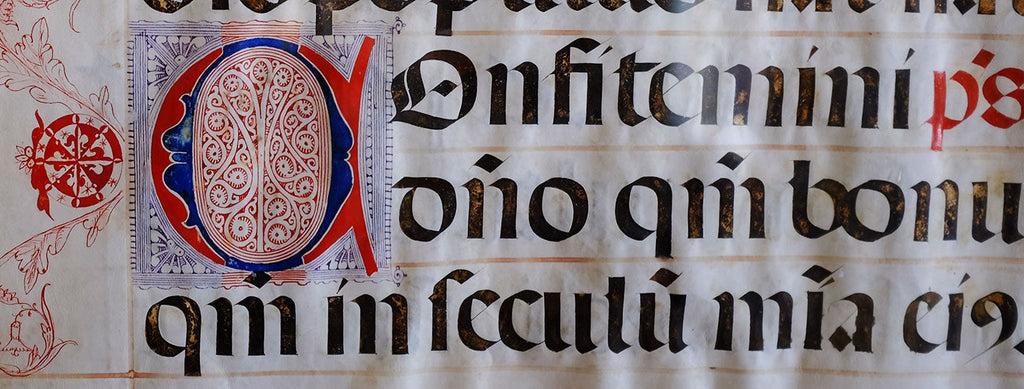
And in this next close-up . . .

More auras surrounding some flux (or is it mooka?) with some tiny orbs in the interstices. And what is that in the middle of the Q? I haven't seen that before. That has great potential for a new border tangle.
Check out the background in that angled pattern. It's not a solid color. It's a tight cross-hatching. What care and affection went into this creation! Perhaps in some dimension, the scribes' hearts are basking in the appreciation of thousands of readers admiring these precious jewels.
Here's a beautiful large illuminated C with marginalia:

I love that positive/negative medallion in the margin with the vinings echoing sampson or is that icanthis? Look at that wonderful adaptation of hollis inside the letter. What a great idea to use hollis to totally fill a section as it curves and grows within itself.
When I interrupted Maria that quiet Saturday back in 2003, she was embellishing a gilded letter with simple patterns in the spirit of these manuscripts. If you've heard our story, that was the seed inspiration for this grand Zentangle adventure. I think that is one reason we were so drawn to these manuscripts.
Here are a couple more examples of some of the smaller initial caps using mooka, hollis, and, of course, lots of auraing.

Here's one more . . .

Notice the triangular fragment to the right of the "S." It looks like fragment F12 in Zentangle Primer Vol 1. What's old is new again. Or, what's new is old again!
See how the artist uses aura in the above three letters to create a slight space between the interior tangle and the letter. That is a familiar technique in Zentangle compositions when a tangle is next to another shape.
And here is the other large capital with marginalia:

The delicate hollis in the margin balances the more structured hollis inside the Q.
In this last close-up we focus on that intertwining cable-like pattern:

I've started playing with different ways to deconstruct it to create a step-out. I think it might be enjoyable to tangle.
This can be a fun exercise for you to explore deconstruction.
Deconstruct ( dē′ • kən • strŭkt′ ) - To reduce a pattern to its elemental strokes so that a user of the Zentangle Method can recreate it as a tangle, by repeating those strokes one at a time in a simple, structured sequence.
(This may already be a tangle out in the Zentangle universe. If it is, let me know. But even if it is, you might try creating your own step-out first.)
Update March 2024: You can view the follow up to this blog here.
Enjoy,
Rick
P.S.
If you're new to the Zentangle blog, the words in italic are names of patterns that we call tangles. A good way to see what tangles look like is to download the Zentangle Mosaic app. It works on iOS and Android. You can search the contents for free. You can subscribe if you want to post and comment.
R
--- + ---
Thank you to everyone who submitted their mnemonic device for ICSO! It was so much fun to read through each and every one.
Bijou has selected Ulrike’s submission Inspired Chaos, Subtly Organized as his favorite! Please send your snail mail address to info@zentangle.com
The commenter randomly selected to also receive a Zentangle surprise is Kathleen McMurty (I Create Something Original). Please send your snail mail address to info@zentangle.com as well!
There were so many wonderful ideas, Bijou also selected some zenorable mentions:
I Can Show off
- Janice Stefane
I Can Save Optimism
- Marina Dali
In Chaos Silence Occurs
- Yvonne Li
In Constant Search Of
- Lori Riden
Images Can Surprise Others
- Judy Grimes
I Can Smile Often
- Jill Maxwell
I Can See Options
- Sally Houghton
Interesting Conundrums = Satisfying Outcomes
- Bee Raine
Intertwined Strokes Create Opportunities
- Katrina Thiebaut
Celebration of Intentional Strokes
- Anne Ott
In Calmness Sense Opportunity
- Catherine Gisby
Elsa Dueñas CZT26 on
Lihda Lovell on
Обичам да търся заплитанията – зентенгъла навсякъде около мен!
И в природата!
И в старите ракли!
И върху сгради!
…..
Навсякъде красота!
Благодаря!
А в буквите!
ТАМ е просто вълшебство!
Нашата стара българска азбука – кирилица е невероятна смесица от тънко майсторство и усет за откриване на вътрешния ни свят!
Може да я прегледате!
Поздрави на всички талантливи творци на зентенгъл!
Специални поздрави на вас, семейство-вдъхновител за моя път в зентенгъл!
Дафинка Парталска on
As I was going through my email, I saw your message and thought I need to check my bank and my meetings before I read that because I’m gonna have to spend some time.
I was right your deep dive was exactly what I was afraid it was so an hour later I have been enjoying it very much and I love how all the different ways people figured out to step out this Tangled showed them many ways. Our minds work.
Thanks for a fun time
Lisa Hoesing on
Barb Burgess on
Si podéis encontrarlo, también hay un dibujo en el cual América no existe y después de las islas Azores se acaba el mundo.
Aquí os dejo el enlace: https://www.lluisvives.com/obra-visor/llibre-vermell-de-montserrat—0/html/ff6fe3e2-82b1-11df-acc7-002185ce6064_90.html
¡Espero qeu os guste!
Un abrazo,
Mariola Moliner
Mariola Moliner on
Kristi Bodin on
@Don , patterns and tangles will never be copyrighted.
It’s the drawing method, the made work and the step-out of a tangle/pattern which are copyrighted.
I also LOVE medieval verse and capital embellishments 😍
ArjadLH, Elefantangle on
Pearl Shifer on
don on
Stunning tangles, fine lines, pristine work. Thx for sharing these Rick. Most enjoyable to see the ancients doing what we’re doing!! I wonder if they named their designs?
Susie Talbot on
Didi on
Susan Arnsten-Russell on
Kathleen McMurtry CZT on
I majored in art with a special interest in art history. My favorite period was Medieval art. The illuminated manuscripts from that era were exquisite! And your photos remind me of them. In 2019 my son and daughter-in-law gifted me and her mother the gift of a lifetime – a trip to Ireland!! We got a chance to see the Book of Kells at Trinity College in Dublin. The holy grail of illuminated manuscripts!! (At least in my opinion-lol!) So your post of those beautiful manuscripts brought back a wonderful memory shared with three special people!
Susan Holsan on
Absolutely gorgeous and inspiring! To imagine that our hands can create patterns that pay homage to scribes from centuries ago is amazing. I also found a fragment that is similar to the angular border pattern: Graticula by Lucy Farran
Katie Crommett on
Zebedee on
Evy Browning on
A second comment for an extra note – thanks also to Helen for the Benoit Ferret’s work referral – it is amazing!
Michelle Dugdale on
Another interesting and inspiring BLOG, thanks for sharing! I love old hand-lettering and manuscripts too…. as well as antique hand-painted maps. I actually received the book of ‘Mira Calligraphiae Monumenta’ for Christmas, following Rick & Maria’s session and enthusiasm at zenAgain2021 (also other books shown/shared by Rick & Maria including ‘Leonardo da Vinci and the Secrets of the Codex Atlanticus’).
I followed Rick’s suggestion to ‘play along’ and have sent my step-out to Julie for that intertwining cable-like pattern identified and highlighted by Rick – thanks for the challenge Rick!
Michelle Dugdale CZT37, Australia on
Wow, what a great coincidence! Thank you for this blog post.
I was in the middle of creating my new website – for the Zentangle workshops I am planning to give – when your mail about the new Certified Zentangle Teachers from CZT-EU #5 arrived. As I am one of them, I enjoy it very much to be officially welcomed by you!
On my website I have a chapter about The Zentangle Method, about your story and how it became the start of Zentangle. To decorate this I copied a picture of a puzzle initial from an old manuscript (from 1389!), zoomed in on a detail with Mooka’s and illustrated this with some little drawings of Flux, both Maria’s and Ricks versions, and of Mooka (the old and the new version).
I was planning to write next to it: Is this the pattern that started it all?
To read today’s blog post about exactly this subject makes it very special.
Karin Derks KasadeCZT on
These are fantastic! And I want to eat where you guys do! 😄 Thanks so much for sharing!
Shawna Oertley on
Alan Quincey on
Maria Vennekens on
Thank you so much for sharing these beautiful documents! Such wonderful talents! I have been fascinated with calligraphy for years, but it wasn’t until I saw Marie’s beautiful pages from her sketch book in the Lecture that was mentioned before of Rick and Marie at NMAI in Newport, RI that I started looking into illuminated manuscripts. The Book of Kells and the Gospels of Lindisfarne are so AMAZINGLY beautiful!!! What amazing talent and patience. Then I learned of “The Grandes Heures of Jean Duke of Berry” I ordered the copy from the Bibliotheque Nationale, Paris by Marcel Thomas. . . It is 12 1/2 inches wide, 17 inches tall, with life size copies of the plates. It is an awe inspiring work of art with birds, angels, leaves of multiple colors, numerous historiated initials per page. . . The Duke wanted it to be the best of the best. It is a one of a kind book.
If you have shown these pages before, they are worth repeating! I’m surprised they were in a restaurant and not in a museum! Beauty is all around us if we will only open our minds to it.
LLS on